[Design] Weekly Challenge – Pin Icon

Yeah, it’s weekly challenge day again ! Today I want to design something looks simple but with some details inside. Again, after searching for a while in Dribbble, I pick two designs out of them and they are all about icons !

Icons
//

Location icon
//

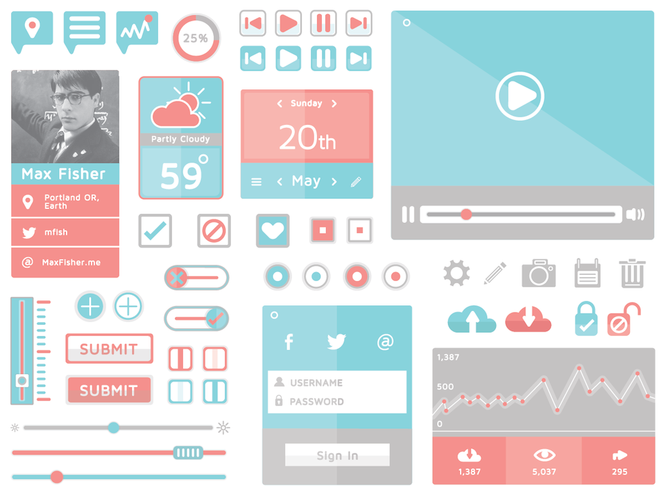
Yes, they all look simple but there are really some details inside. For the first design, it uses shadow to make the image jump out with a little bit 3D effect. While for the second one, you can notice the designer only use few colors, bold lines to make it flat and clean. So here comes my brainstorming time, is it possible to make a pin icon like the second design and also it still has shadow inside to make it not so boring ?

Instead of starting to open my illustrator at once, there is also another idea hitting my mind. I want to make the pin icon different from the others with some personal ideas. After seeing so many pin icons from Google, I noticed that they all miss an important concept – What happened in the pinned place at that time ? Is it possible to provide information about Geo location and some random screenshots at that place ? If yes, for users, this may be more friendly to use when navigating the online map.

So here comes my design :

pin

Yes, it is a pin icon but with some functionalities I want – a placeholder for images (with 15% opacity), shadows to make it 3D, and  itself – a pin which makes you pin the place you want on the map. And I also make image about the real use case for this pin :

pin-map

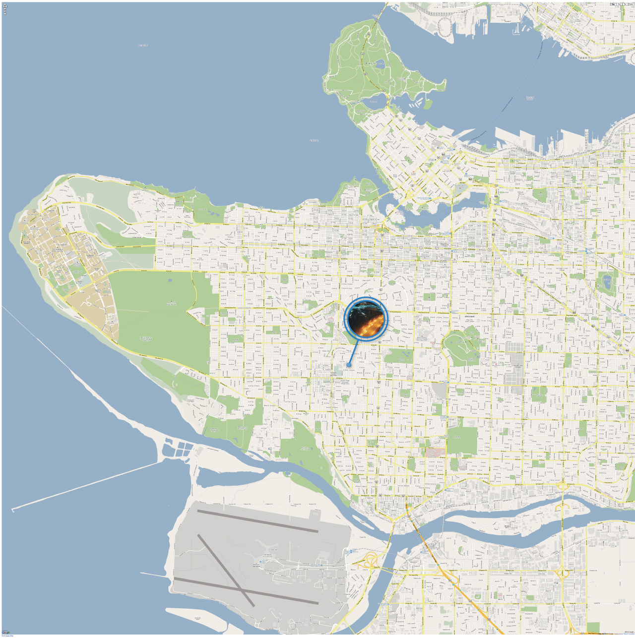
It may look not so clear, so you have to click on the image to check the real size (still compressed, but bigger).

Some Thoughts

From this challenge, I learned some skills about how to put shadow on images and how to make an image mask to showcase part of content you really want. And also, it is important for designers to think more about the real use case of what they designed before turning on illustrator. In this way, you won’t live in your own ivory tower.

That’s it, hope you guys like it and I would keep practicing on the way to design. Can’t wait to accept coming challenge next week, cheeeeers ! 😛


[Git] How to maintain a huge and long-lived branch

pr

Story

Currently I am maintaing a god damn long-lived and huge branch on my local and for me, this is xxxx annoying -_-. Here comes a tip first, please make sure to break down your patch as much as you can. For me, this patch looks kinda independent and tiny enough, but I am wrong in the end.

As you can see, this branch has changed almost 60 files in the codebase and change of LOC has increasing to 5000 ! So, you can definitely guess that there must be so many conflicts happened especially Mozilla/Gaia is such a huge open source project and is contributed by lots of hackers from different timezones in this world. Based on my observations, it can hit more than 5000 LOC changes like features, bugfix … etc per day !

But, this case helps me to get familiar with how to keep your branch up-to-date with main trunk and I already came up with a small SOP to help me on this. In order not to forget this important experience (I don’t think I will forget xD), I would write them down about how I made it.

SOP

  • git checkout -b bug-973466-backup-20140619
    • Make sure to backup one copy of your current branch in case of something broken when rebasing. In my case, because I have to keep it up to date with main trunk all the time, it would be better for me to use Date format to make it readable and easy to identify.
  • git checkout bug-973466
    • Jump back to current branch
  • git rebase master
    • Rebase your code onto master to keep updated with it
  • Solve conflicts
    • You will find so many conflicts in this stage, and please don’t be afraid, use github / git diff / vimdiff or anything whatever to make sure there is nothing broken in this stage and both of theirs and ours changes are still there.
    • If you got lost in this stage, just did git rebase --abort to exit the process and there is nothing influenced ! Yeah.
  • If you successfully solve conflicts and nothing is wrong, it’s great ! You are free now !
  • If you found something wrong later after rebasing, it’s too late to recover, that’s why we need a backup ! Just remove your current branch and replace it with backup one, nothing is broken now ! Nice !

Some thoughts

  1. Don’t make your branch huge and try to break it down to smaller parts.
  2. If your current move is danger and hard to recover, always remember to make a backup.

Hope these information helps ! Any idea or feedback is welcome !

[Design] Weekly Challenge – Flame Flag

Yeah, today is weekend ! It means I can put more time and efforts on stuffs I like. After coming back from the swimming pool, it’s kinda a good time to practice designing something. After doing a quick grep form dribbble, I noticed two interesting works :

Fire
//

Fort York
//

The first work is a fire composed with word fire while the second one is waving flag. These two works like may not be so related at the first glimpse, but I think that would be interesting to combine both of them into one specific work. Based on this concept, I made another design called Flame Flag.

flame-flag

In this work, I learn how to use ruler to measure the length and degree of specific line, get more familiar with some hotkeys and do a sketch before drawing on Illustator. Although the image looks simple and without too much details, I still spend more than 2 hours on making some baselines, measuring details and some other stuffs.

I think I can finally understand a little bit of designer’s lives. The devil is definitely in the details. That’s it and hope you guys like this ! Any feedback or responses is appreciated 🙂

[Design] Weekly Challenge – Angel Star

A Star + Wings
//

When browsing some latest works in Dribbble, I accidentally notice this work made by Dizzyline. For me this design is simple, clean and also has some details behind it (Like shadow). As a illustrator newbie, I think this one may be a nice first start for me to practice my skills.

So, I made another logo called Angel Star.

angel-star

Based on the original logo, I noticed there are shadows in it to make the wing a little bit more 3-dimensional. Except that, I learned how to make paths join together with [Cmd+J] and how to mirror stuffs. For a new hand, this is kind a good start and the result looks acceptable for me.

Can’t wait to pick up my pen with next challenge 😛

[Design] Flat UI Design

Image Credit

flat-ui

Flat User Interface Design is a minimalist aesthetic principle or design language currently used in various graphical user interfaces.

From wiki

Just realized that I have to spend some time on learning designs. As an engineer, this is kinda far away from my specialities but some knowledge about designs may help when discussing with UX / UI designers. No matter how, they are indeed interesting 😛

[Javascript] TwZip.js

twzip

Github Link

最近因為 Hax4 有 project 需要用到台灣郵遞區號,所以就花了一點時間做了一個簡單的 js (jQuery) plugin – TwZip.js。不過身為一個前端工程師當然想把事情都留在前端處理就好,因此當初在設計這個 plugin 的時候就打算把所有的資料都放在前端,然後以 lazyload 的方式把資料載進來而不需要後端的支援(超懶)。

而說到資料,TwZip.js 的資料是從中華郵政全球資訊網下載來的,然後簡單寫了一個 makefile 搭配 node.js 自動產生數百個鄉鎮市區的 metadata 供前端使用。

這邊要提一個我一直被卡住的白痴問題(OS 老師當初應該把我當掉),因為原本我的設計是三層式架構(像是 台北市/信義區/信義路),但是這會造成資料過度碎片化的問題。之所以會這樣是因為在 file system 裡面最小單位的 block or Cluster 有一個最小容量,像我電腦就是 4 KB,所以如果資料小於 4KB 就還是以 4KB 計,因此這個三層式設計最後就產生出 16X MB 的資料(因為產生出太多 metadata 了)… 整個比原本的專案大上好幾十倍呀 …

為了解決這個問題,最後就改成兩層式架構(像是 台北市/信義區,也因為層數變少的關係所以最後就變成約 4 MB 的資料了,整個就是皆大歡喜。

還記得以前的前輩曾經教過我在寫程式的時候要先把 API 想好,確定使用者使用的介面再開始寫細節,透過這樣的決定來讓整個專案照著預期的方向前進才是比較好的,這樣才可以提前知道這個設計上的缺陷及問題,算是又多了一點體悟吧!

儘管如此,目前這個 plugin 還只能算是一個 prototype ,未來應該會再把 zipcode 的資訊透過 callback 傳回去。其他的功能就再說吧。

DogFooding ++